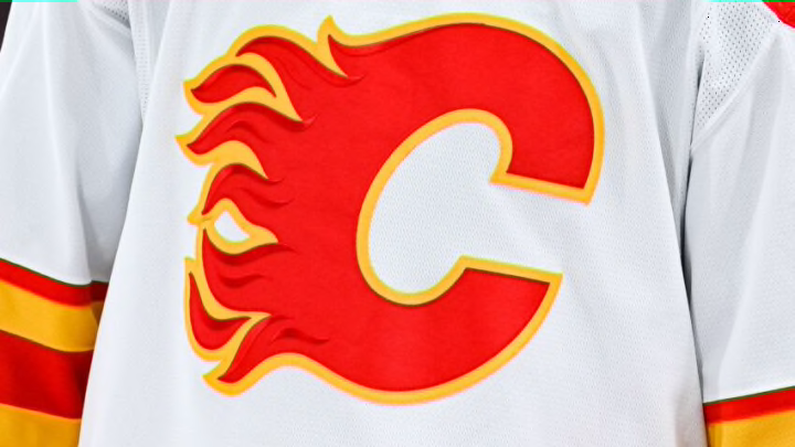
10th: 2013-16 Alternate Calgary Flames Jersey

These sweaters were a dumpster fire. From the cheap script font nestled behind an awkwardly placed Flaming C, which together served as a “crest”, to the bat-wing shoulder yokes, to the long black collar, to the font used for the jersey numbers and nameplates, this Calgary Flames jersey was outright bad. I hated it then and I hate it now.
Perhaps this Flames jersey’s only slightly redeeming element was its secondary logo used on the shoulders, which still wasn’t anything special.
